{Carrer web log}
CSS Specificity - Cheat Sheet
Tuesday, September 29, 2009 { 14 Comments }
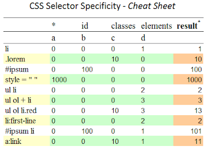
One of most common difficulties with CSS is determining what CSS rule will be applied on the page. That was my nightmare when I started with CSS.But actually is not so hard to understand how these rules are applied and the order of CSS Specificity.
I created CSS Cheat Sheet that I hope it can help you understand CSS Specificity better.

Download:
CSS Specificity - Cheat Sheet(.png)
CSS Specificity - Cheat Sheet(.pdf)
CSS Specificity - Cheat Sheet(.xls)
CSS Specificity - Cheat Sheet(.ods)
There are many articles talking about this issue, here are some:
- Calculating a selector's specificity
- CSS Specificity: Things You Should Know
- CSS: Specificity Wars
- Everything You Need To Know About CSS Selector Specificity
- Link Specificity
- Specificity | HTML Dog
- Understanding Specificity
Blog prototyping with Emastic using the Golden Proportion
Tuesday, September 22, 2009 { 3 Comments }
Our goal is to build blog web layout using the Golden Proportion and Emastic – CSS Framework.More details on the Golden Proportion you can find at:
- Golden ratio - Wikipedia
- Golden Ratio in modern CSS - CSS Globe
- Design and the Divine Proportion - Mark Boulton
Few things about Emastic.
- Emastic is built with ems to improve usability.
- There are three layout systems inside Emastic the basic built width em, one based on % and one based on positioning.
- Emastic supports fixed and fluid columns.
- The typography is based on baseline grid.
First we need some measurements in order to start. We can take some modern layout 955 to 980 px . We know that the golden ratio is 1 : 1.618.
How can the golden ratio fit in Emastic?
If we take that the default width is 980px than will have: 606px and 374px columns. Closest to 606px in emastic is 600px(or 50em) and we add 600px to 371px which is equal to 971px(GP).
Ok,so we have one 50em(600px) column. What about the other 371px column?
No problem, we can always use the fluid column and the problem is solved.
So we need main column(container) with 971px or (917/12 = 80.916em). One column of 600px = (600/12 = 50em) in emastic is dl60 meaning div left 60em and for 371px column we need to use the fluid class.
<div class="main"><div class="dl50"></div><div class="fluid"></div></div>

And this is it. We have blog template respecting the golden proportion.

Download the template (.zip)
About Me <<<
Name: Vladimir Carrer
vladocar [at] gmail.com
Location: Verona, Italy
I'm a web designer, developer, teacher, speaker, generally web addicted ...
My projects <<<
- AI Prompt Directory
- Hand Drawn Icons
- Font Design Inspiration
- Font Pairings
- Free SVG Cut File
- Upcoming NFT projects
- Discord Tutorials
- Free Sublimation Designs
- Tech Feed
- MySQL Lite Administrator
- Quark Mini PHP CMS
- Formy - CSS Form Framework
- Emastic - CSS Framework
- Malo - CSS Library
- The Golden Grid
- 1 line CSS Grid Framework
- Two Lines CSS Framework
- Child Selector System - CSS Framework
- Better Web Readability Project
- Azbuka - CSS Typographical Base Rendering Library
- ClipR - bookmarklet for better reading
- CSS3 Action Framework
- CSS Mini Reset
- HTML5 Mini Template
- CSS Mobile Reset
- picoCSS - JavaScript Framework
- HTML Lorem Ipsum Crash Test
- Object Auto Documentation - JavaScript
- o - JS Library for Object Manipulation
- Foxy - CSS Framework
- Tumblr Free Theme - Better Readability Project
- Box - CSS Framework
- SMART CSS GRID
- nanoJS - Minimal JS DOM Library
- Flexy CSS Framework
- Katana is CSS Layout System made with Flexbox
- Micro CSS Reset
- 60 Grid System
- Simple CSS Button
- ramd.js JavaScript library for making web applications.
- Minimal Notes web app build with Vue.js
- Scribble Font for Prototyping & Wireframing
- Flex One - 1 CSS Class System
- Floaty - CSS Float Based Layout System
- Infinity CSS Grid
- CLI Convert websites into readable PDFs
- keywords-extract - CLI tool, extract keywords from any web page.
- screenshoteer - Make website screenshots and mobile emulations from the command line.
- Basic.css - Classless CSS Starter File
§§Previous Posts <<<
- GPT-3 and CSS Frameworks
- Don’t use CSS Reset use CSS Set
- One Page 2020 Calendar Print Version
- 3 CLI tools based on Node.js
- Scribble Font for Prototyping & Wireframing
- ramd.js - Small JavaScript library for making TODO...
- Katana.scss - CSS Layout System made with Flexbox
- Flexy CSS Framework
- nanoJS - JavaScript for DOM manipulation
- SMART CSS GRID
§Archives <<<
- May 2006
- June 2006
- July 2006
- August 2006
- September 2006
- October 2006
- January 2007
- February 2007
- October 2007
- April 2008
- June 2008
- July 2008
- August 2008
- September 2008
- November 2008
- December 2008
- January 2009
- February 2009
- March 2009
- April 2009
- May 2009
- June 2009
- August 2009
- September 2009
- October 2009
- November 2009
- December 2009
- January 2010
- February 2010
- March 2010
- April 2010
- May 2010
- June 2010
- July 2010
- August 2010
- September 2010
- October 2010
- November 2010
- December 2010
- January 2011
- February 2011
- March 2011
- April 2011
- May 2011
- June 2011
- July 2011
- August 2011
- September 2011
- October 2011
- November 2011
- December 2011
- January 2012
- February 2012
- March 2012
- April 2012
- June 2012
- August 2012
- November 2012
- January 2013
- March 2013
- June 2013
- October 2013
- November 2013
- March 2014
- September 2014
- October 2014
- November 2015
- March 2018
- May 2018
- June 2018
- July 2018
- October 2018
- January 2019
- January 2020
- June 2020
- April 2021
Other Profiles <<<
Content is licensed under a Creative Commons Public Domain License


