{Carrer web log} ←
Opera 10.50 for one week - Summary
Monday, March 15, 2010 { 25 Comments }
Last week I started an experiment to use Opera 10.50 like primary browser for week.Thank you all for the wonderful feedback and support.
Here are the results: Opera is really fast and fluid. And is real pleasure surfing the web.
If I need to define Opera with one word I would say: Opera is Linux. Why is that?
They bought have Scandinavian origins, both have small market share, passionate community support, Linux have problem with drivers Opera with plugins. Big companies have no interest developing drivers or plugins because of the small market share. So community developers must provide them.
And the final truth Opera is build from programmers to programmers.
So my slogan for Opera is "Opera from programmers to programmers".
Problems I encountered in Opera. Many advised me to use Opera 10.10 like more stabile version. This is probably true Opera 10.50 sometimes “forget” to render the page. Also RAM garbage collector is not fine tuned.
And the big issue the User Interface.
In Opera you can personalize everything and I have no problem with that. I have problem how you do that.
So I wont to dedicate this part of the post to express my Opinion on how I imagine Opera. I like to give my small contribute and help Opera improve.
First the plugins, because Opera small market share the developers prefer to build plugins for Firefox. So it will be wise Opera to build some tools for easy plugin development. So the developers can easy switch and build plugins for Opera.
I’m more fan of bookmarklets because they can work in every browser, but sometimes plugins can be very complex and can’t be replaced with bookmarklets.
The interface:
It can be pretty confusing. With the web we are used of the philosophy “Don’t make me think”. For me good interface is one who starts simple in the start but in the background you can personalize almost everything.
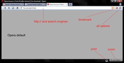
So I open Photoshop and tried to make my personalization of Opera. In other words mini redesign of Opera.
The main idea is when you start with Opera to have few things that you really need. Imagine some IE7 user who wants to try the new Opera browser because he heard that is fastest but with the first impression of Opera he is "dazed and confused" and he leaves Opera forever for IE8 maybe.
Keep it Simple and Don't Repeat Yourself

The default start

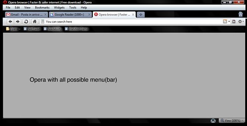
Opera with all the menus

Download the Photoshop file with the design
And this is it. I think there are many menus that actually nobody uses.
With the default settings of Opera you can navigate, search, zoom, print, bookmark. Nothing else.
If you need to configure Opera Turbo or Opera Unite go to the configuration options in the background options and configure it. If you are advanced user and you need to download torrents go to opera:config configure it.
So again "Keep it simple" for the normal user and leave all the complex stuff in background for advanced uses.
Dragonfly is cool. Specially for me like CSS guy Dragonfly is most important tool. Here are some ideas what can be added to Dragonfly. What about CSS redundancy checker? It could useful for many web designers. Also one thing that I can’t find anywhere, speed simulation directly from the browser. I think that Dragonfly need something exclusive and original in order to be used over Firebug.
Also I think can be handy to add some tools for Mobile development and testing directly from the web browser. I know that there are some online tools like Opera mini demo . But I think that having that tool inside the browser can be cool idea.
Few words about CSS3 - great job Opera CSS team. I really love the Opera strategy about CSS3. I will probably dedicate one post about this issue.
There are probably many other things that can be discussed and talk about but I will leave the comments for that.
Summary: Opera is fast and more important once the page is loaded the navigation is smooth and fluid.
Main issues are confusing UI and plug-in support that with little effort can be resolved. Opera is definitely going in right direction.
Will I continue to use Opera like my default browser? I don’t know. I’m plugin dependent I use plugins for everything (Twitter , Color, Seo, The Grid, Measurements, Spelling, Cookies all Social Network …) . Probably that is the only reason why I’m bonded with Firefox. So for normal browsing I will probably use Opera and for work Firefox.
Question I will you leave you with: What you love and hate about Opera? And what Opera should do to become better browser?
25 Responses to “Opera 10.50 for one week - Summary”
-
//
// 3/15/2010
What I love about opera, is that is very customizable, has a lot of features and is one of the fastest browsers around. I enabled the menubar (I hate programs that have no menu bar), removed some of the default buttons and the search field (rightclick - remove from toolbar, search field functionality is already present in the address bar anyway), I added my own search engines (for youtube, etc...). I disabled plugins (like flash, silverlight, etc...) and disabled javascript globally and enabled it through the site preferences only for the sites that really need it (like youtube, gmail, zoho, etc...), installed the 'UJS Manager' from the 'opera unite' appilications. I enabled the mail client and added 32 feeds to my feed manager. And last I enabled opera link, so my bookmarks (and speed dial, etc...) are synced with my cell phone and my other computer. And after all of that, I don't really notice any slow downs. I tried to do that with firefox, but all extensions, made it unstable and extremly slow)
I hate the fact that the source viewer doesn't have line numbers (the error console does show the line number of the error though). It would be really nice if the spelling checker would be in the site preferences. It has no build in userjavascript manager. I can't really think of anything else. -
//
// 3/15/2010
You are trying to invent the wheel
Oslo, Norway - June 27, 2001
Funcom today unleashed its popular game Anarchy with its own browser created on the Opera Composer from Opera Software. The Opera Composer, also released today at PCExpo in NY, lets users create their own browser and download it for free from the Internet.
http://composer.opera.com/composer6/
"Opera Composer is a free, online tool that lets you create your own customized versions of the Opera browser for distribution.
Opera Composer allows you to choose your own Speed Dial, bookmarks, toolbars, skin and many other features before using the Opera Web browser." - // Vladimir // 3/15/2010
- // StCredZero // 3/15/2010
- // Vladimir // 3/15/2010
- // // 3/15/2010
- // Vladimir // 3/15/2010
-
//
// 3/15/2010
What I love about Opera? Almost everything, but mostly it UI. It is simply functional when it comes graphics and transparency. I'm on Win 7 so it is even more fun.
What I hate: Dragonfly and JS Console. Not because is it not functional and extremely useful, but just because it is a hosted application. I'm in a part of the World (West Africa) where the internet is not always available, or could be off a poor quality. And sadly, without the internet, there is not way I can use Dragonfly. Mostly I have to switch to IE8 in order to be able to use most features I need.
Secondly, the compared IE8 Developer Tools JS Console or the Firefox JS Console, Opera's sucks. It does not immediately point out the error to you and if when it does, the error message sometimes does not make immediate sense. You have to be extremely technical to understand. IE8 and Firefox on the other hand have super simple error messages that point to the exact line of the error, which makes them better to work with. (Personally, I haven't used Firefox much since IE8 came along)
So that is about it. - // // 3/15/2010
- // Vladimir // 3/15/2010
- // // 3/16/2010
-
//
// 3/17/2010
Vladimir // 3/15/2010
@Stve: I didn't know about Opera Composer, it definitely looks cool. Thank you for sharing. But my point of the redesign was to give simple version of Opera for the new users who start with Opera, because menu people are confused by Opera default "look" - Interface.
:
I know what you are trying to do it's a great idea but Opera thought of it about 10 years ago
Composer is not for making your own version for Personel use it's all about making a standard version that you configure for other people.
A trade Union made its own version & rolled it out to it's members
A game company made one for players of one of its games.
A Teacher could make one for his pupils preloaded with Bookmarks with folders aranged by subject or date & filled with useful links
you could make a simple interface for the kids & beef up the secuirity by disabling java sript ect.
You can still get it now at Opera site. It's been available for 10 years & the options sound great but you never hear of it.
By the way are you aware that Opera made Dragonfly open source last month.
Not into it myself last time i wrote code it was Basic about 30 years ago. - // // 3/17/2010
-
// Vladimir
// 3/17/2010
@Stve: I find out so many "hidden" things in Opera and Dragonfly in this week and I still don't know anything about Opera ;). My point was Opera should start with simple configuration because 70% of normal users don't know how to change the default(home) page, they don't know what cookie is or javascript . They just like to use the browser.
- // Aleksander // 3/18/2010
- // // 3/18/2010
- // // 3/18/2010
- // // 3/18/2010
- // Iván // 3/19/2010
-
//
// 3/22/2010
It's nice to see that there are still people who gives a whole week for a new browser... :)
Although I can see the time was insufficient. First a common mistake. plugin is like Flash, Java Silverlight and so on, what you're talking about are extensions. Opera do have problems with plugins thought.
I don't exactly get your opinion on the UI, i think it is simple (simple than before), and fully customizable. I see, you like Chrome UI. The funny is, that the layout you created can be done in Opera (I'm not sure about the "all options" part). As you were told earlier, the search bar can be removed (only Chrome does that by default).
So, as an "Opera-extension" you can use custom buttons, here are some to start with: http://homepage.hispeed.ch/ttt-o/button/h-bu-browser-adv.html. Of course, you can create your own ones as well.
Anyway, I think that ie7/8 UI is much more confusing than Opera...
"Also I think can be handy to add some tools for Mobile development and testing directly from the web browser."
I don't know whether you found it or not, but how about actually debug a phone on your PC? Just check out Opera Mobile and the remote debugging. Here is some info: http://dev.opera.com/articles/view/remote-debugging-with-opera-dragonfly/ and a video as well: http://www.youtube.com/watch?v=sZt-k93qLbg -
// Vladimir
// 3/23/2010
@ Anonymous: I think one week period is perfect for web browser testing. Because you are starting to change your habits. It is your habits that prevent you for using anything else beside your preferred browser.
About UI my idea is start with simple than upgrade. But this is just me. There are people to start with complex UI and than personalize. - // // 3/25/2010
- // // 3/29/2010
- // metude // 8/08/2010
- // Vladimir // 8/08/2010
<< Home
About Me <<<
Name: Vladimir Carrer
vladocar [at] gmail.com
Location: Verona, Italy
I'm a web designer, developer, teacher, speaker, generally web addicted ...
My projects <<<
- AI Prompt Directory
- Hand Drawn Icons
- Font Design Inspiration
- Font Pairings
- Free SVG Cut File
- Upcoming NFT projects
- Discord Tutorials
- Free Sublimation Designs
- Tech Feed
- MySQL Lite Administrator
- Quark Mini PHP CMS
- Formy - CSS Form Framework
- Emastic - CSS Framework
- Malo - CSS Library
- The Golden Grid
- 1 line CSS Grid Framework
- Two Lines CSS Framework
- Child Selector System - CSS Framework
- Better Web Readability Project
- Azbuka - CSS Typographical Base Rendering Library
- ClipR - bookmarklet for better reading
- CSS3 Action Framework
- CSS Mini Reset
- HTML5 Mini Template
- CSS Mobile Reset
- picoCSS - JavaScript Framework
- HTML Lorem Ipsum Crash Test
- Object Auto Documentation - JavaScript
- o - JS Library for Object Manipulation
- Foxy - CSS Framework
- Tumblr Free Theme - Better Readability Project
- Box - CSS Framework
- SMART CSS GRID
- nanoJS - Minimal JS DOM Library
- Flexy CSS Framework
- Katana is CSS Layout System made with Flexbox
- Micro CSS Reset
- 60 Grid System
- Simple CSS Button
- ramd.js JavaScript library for making web applications.
- Minimal Notes web app build with Vue.js
- Scribble Font for Prototyping & Wireframing
- Flex One - 1 CSS Class System
- Floaty - CSS Float Based Layout System
- Infinity CSS Grid
- CLI Convert websites into readable PDFs
- keywords-extract - CLI tool, extract keywords from any web page.
- screenshoteer - Make website screenshots and mobile emulations from the command line.
- Basic.css - Classless CSS Starter File
§§Previous Posts <<<
- Initiative - Opera 10.50 for one week
- Quark – mini php CMS
- The Golden Grid PSD Template
- WikiReader – bookmarklet for Wikipedia reading
- CSS Shorthand Clockwise Rule
- Calendar 2010
- Bookmarklet for Google Dictionary
- To Do List (A4 Paper – Grid Design)
- Azbuka - CSS Typographical Base Rendering Library
- Serif vs. sans-serif legibility
Other Profiles <<<
Content is licensed under a Creative Commons Public Domain License


