{Carrer web log}
CSS3 Action Framework
Tuesday, April 27, 2010 { 3 Comments }
It all started when I wanted to do Google CSS3 redesign. The propose of that redesign was to use as much as possible CSS3. I wanted to maintain Google minimalistic style with little Apple flavor and Bing background style. Also to use only pure CSS and CSS3. And the result was:Example: Google CSS3 redesign
CSS3 is really powerful tool and many of the things that early were done with some JavaScript library now can be done with CSS3.
When I write CSS I usually extract all the best practices and try to make little library so in the next project I will not write the same code over and over again . Don't repeat yourself.
After the Google CSS3 experiment I decided to spend little more time and make little CSS3 action library(framework).
The library is based on :hover, :active and :target and mainly on CSS3 transforms.
Here are some examples:
About the code syntax
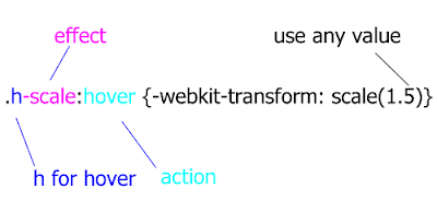
If you have multiple .h-scale values you can personalize your values.

How the system works?
About :hover(mouse over) and : active(mouse click) is very easy to understand. The HTML element will perform some action(scale, rotate, hide ..) on mouse over or mouse click.
Example:
This div will scale on mouse over and rotate on mouse click
<div class=" h-scale a-rotate ">…. </div>Example:
The click of the link will trigger scale event on the image. Everything is possible because of href=”#a” calls id=”a” of the image.
But the best way to learn is to play around with the CSS file and the examples. The code will work mainly in latest version of Firefox , Chrome, Safari and Opera. The cool thing is that even if this CSS doesn’t work in some browsers(mainly IE) the page will look exactly the same, obviously all the events will be off in the older browsers.<a href=”#a”>Some link</a>
<img id=”a” class=”t-scale” src=”” />
Please feel free to add more functionality to this library, new events, new features extended browser support ( I was lazy to optimize for IE8 and lover), change or extend the naming system if you don’t like my naming conventions.
I hope that this project can help you understand some of the new CSS3 features. Principally is made for teaching purpose but can also used in production.
This project is hosted on Google Code
Download the code & examples
I will leave you with this thought: CSS3 is powerful make up tool, do you want to look pretty?
Minimalistic Wallpaper for iPad
Tuesday, April 13, 2010 { 1 Comments }
This two weeks seams the whole world talk about one thing iPAd. So if you can't beat them join them. I feel that I’ve been brainwashed by this iPad thing :)I decided to build wallpaper for the iPad. I’m not sure why I did it, iPad is not even arrived in Italy. I’m not sure that I’m going to buy it but I wanted to create my own iPad wallpaper.
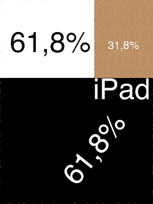
I wanted to be book like and simple and to contain the golden proportion(I’m little obsessed about the golden proportion lately)
So here is the result (768px X 1024px 132dpi)
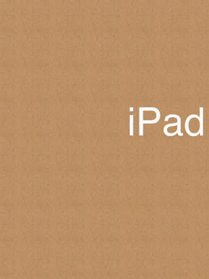
I used Helvetica like a font and white color to make contrast with the iPad black frame.
Here is how I used the golden proportions:
Enjoy
Photoshop glyphs tester
Thursday, April 08, 2010 { 4 Comments }
Three different project inspired me to this Photoshop tool.Arial versus Helvetica, GLYPHS Palette petition by @ilovetypography and Web Font Specimen by Tim Brown
I needed a tool who can visualize and compare basic glyphs from the English Alphabet and can be easily extendible.
I didn’t find any tool on the market for comparing different fonts. So decided to build one. Photoshop like a most used graphical tool seems to be a logical choice for this project. So that is why I used Photoshop instead of Illustrator. Photoshop is everywhere :)
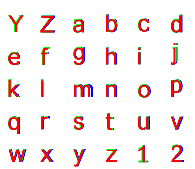
Every letter(glyph) is a different layer in Photoshop and all the glyphs from the same font make one Photoshop group(by default can be Red, Green and Blue). Every group(and all the glyphs inside that group) is exactly above or below the other group so we have perfect mach of all the letters(glyphs).
You can easily select and change the font or color of all the letters inside one group so you can compare any font installed on your computer.
By default are three web safe sans serif fons groups R ( red color 144px Arial), G(green color 144px Tahoma )B(blue color 144px Verdana). Feel free to change the font add new group or glyph.
>> Download Photoshop glyphs tester
About Me <<<
Name: Vladimir Carrer
vladocar [at] gmail.com
Location: Verona, Italy
I'm a web designer, developer, teacher, speaker, generally web addicted ...
My projects <<<
- AI Prompt Directory
- Hand Drawn Icons
- Font Design Inspiration
- Font Pairings
- Free SVG Cut File
- Upcoming NFT projects
- Discord Tutorials
- Free Sublimation Designs
- Tech Feed
- MySQL Lite Administrator
- Quark Mini PHP CMS
- Formy - CSS Form Framework
- Emastic - CSS Framework
- Malo - CSS Library
- The Golden Grid
- 1 line CSS Grid Framework
- Two Lines CSS Framework
- Child Selector System - CSS Framework
- Better Web Readability Project
- Azbuka - CSS Typographical Base Rendering Library
- ClipR - bookmarklet for better reading
- CSS3 Action Framework
- CSS Mini Reset
- HTML5 Mini Template
- CSS Mobile Reset
- picoCSS - JavaScript Framework
- HTML Lorem Ipsum Crash Test
- Object Auto Documentation - JavaScript
- o - JS Library for Object Manipulation
- Foxy - CSS Framework
- Tumblr Free Theme - Better Readability Project
- Box - CSS Framework
- SMART CSS GRID
- nanoJS - Minimal JS DOM Library
- Flexy CSS Framework
- Katana is CSS Layout System made with Flexbox
- Micro CSS Reset
- 60 Grid System
- Simple CSS Button
- ramd.js JavaScript library for making web applications.
- Minimal Notes web app build with Vue.js
- Scribble Font for Prototyping & Wireframing
- Flex One - 1 CSS Class System
- Floaty - CSS Float Based Layout System
- Infinity CSS Grid
- CLI Convert websites into readable PDFs
- keywords-extract - CLI tool, extract keywords from any web page.
- screenshoteer - Make website screenshots and mobile emulations from the command line.
- Basic.css - Classless CSS Starter File
§§Previous Posts <<<
- GPT-3 and CSS Frameworks
- Don’t use CSS Reset use CSS Set
- One Page 2020 Calendar Print Version
- 3 CLI tools based on Node.js
- Scribble Font for Prototyping & Wireframing
- ramd.js - Small JavaScript library for making TODO...
- Katana.scss - CSS Layout System made with Flexbox
- Flexy CSS Framework
- nanoJS - JavaScript for DOM manipulation
- SMART CSS GRID
§Archives <<<
- May 2006
- June 2006
- July 2006
- August 2006
- September 2006
- October 2006
- January 2007
- February 2007
- October 2007
- April 2008
- June 2008
- July 2008
- August 2008
- September 2008
- November 2008
- December 2008
- January 2009
- February 2009
- March 2009
- April 2009
- May 2009
- June 2009
- August 2009
- September 2009
- October 2009
- November 2009
- December 2009
- January 2010
- February 2010
- March 2010
- April 2010
- May 2010
- June 2010
- July 2010
- August 2010
- September 2010
- October 2010
- November 2010
- December 2010
- January 2011
- February 2011
- March 2011
- April 2011
- May 2011
- June 2011
- July 2011
- August 2011
- September 2011
- October 2011
- November 2011
- December 2011
- January 2012
- February 2012
- March 2012
- April 2012
- June 2012
- August 2012
- November 2012
- January 2013
- March 2013
- June 2013
- October 2013
- November 2013
- March 2014
- September 2014
- October 2014
- November 2015
- March 2018
- May 2018
- June 2018
- July 2018
- October 2018
- January 2019
- January 2020
- June 2020
- April 2021
Other Profiles <<<
Content is licensed under a Creative Commons Public Domain License
