{Carrer web log}
Canvas Grid - JS1K entry
Thursday, September 30, 2010 { 4 Comments }
If you are Java Script developer you probably heard about 1k Javascript contest.Like many I also wanted to experiment with the new HTML5 canvas element. There are many canvas demos on the contest that are incredible. It still amaze me what people did with 1Kb of JS.
I started with the thought not to build something cool but something useful that can be used after the contest.
The main inspiring idea were the Mark Pilgrim thoughts and examples about canvas.
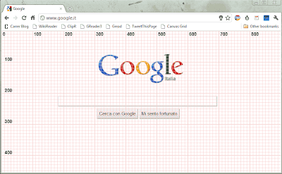
I decided to build simple Canvas Grid with 10px squares and 100px marks around all the visual browser space.
I used the code to later build an bookmarklet who can help many web designers to better understand the relation between browser dimensions and the web site.
And here is a picture what this bookmarklet does:
And here is the bookmarklet:
Canvas Grid - Drag the link to your browser bookmark toolbar, use F5(refresh) to clear the grid
Note: In some cases you will have web site colors that are similar to the grid lines or have high contrast and you will get non clear results. Fell to modify this script or bookmarklet in any way you like. If you have any questions fell free to comment or send me an email.
I have great startup idea: It’s Hacker News ReDesign
Friday, September 24, 2010 { 0 Comments }
Hacker News is probably the best community for startups, computer businesses, new progressive technologies and movements, new programming languages and database concepts ..The "problem" with HN is that is rapidly growing. Every day many new "hackers" are joining the site pushing more end more news and discussions.
But the growth without proper direction and vision can destroy one web site. Excellent example for this is Digg. They didn’t manage to control their growth and the users are leaving the site. Another but this time positive example is Reddit everyone thought they will fail but they canalize their enlargement and did proportional and healthy growth.
I think that the HN founder and maintainer of the site Paul Graham is deliberately trying to keep HN less attractive for the newcomers in order to maintain the quality not quantity. So the site has never been seriously redesigned.
But like I sad the community is growing, and the users need site that works.
This is my personal list of the things that need to be changed:
1) Better readability(typography) I wrote before about this.
2) Official Site Search
3) Official API
4) Possibility to bookmark an article (there are some HN discussion and advices that are priceless, I don’t want to use Delicios for that anymore)
5) Official Tell HN section (people desperately need some place where can show their products, new ides, new startups …)
6) 30 + 5 just submitted articles on the front page ( this can give more possibilities to the new articles to get more attention)
7) Your thoughts, what you want to the new HN?
How all this can be done?
There are probably many people including myself that are willing to help for 20.000$ (that are usually the money that HN gives for one startup).
How can this startup earn money?
By one Ad one month program. There are many sites like Daring Fireball that have only one Ad on the web site that doesn’t disturb anyone.
So you have 20000$ investment for the site redesign and if you charge 1666$ per mount for the Advertisement you will earn 20000 in one year.
I was playing with my new wireframing tool and I sketch the New HN
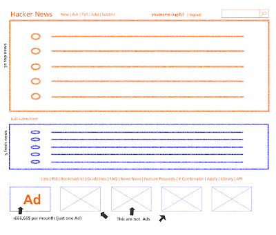
Click to Enlarge
Your thoughts are precious, you can also comment on HN
Fireworks Mini Web Wireframing Kit
Thursday, September 23, 2010 { 1 Comments }
Recently I saw Jonas Skoglund Fireworks wireframes kit (Dragnet) that directly inspired me to try Fireworks as an prototyping tool and build this mini kit.For this experiment I used Fireworks 8 (very old version of Fireworks).
The idea behind this mini wireframe kit is to give you just the essential shapes for web wireframing. For everything else you can use natively Fireworks because Fireworks itself is great tool for prototyping and wirefriming.
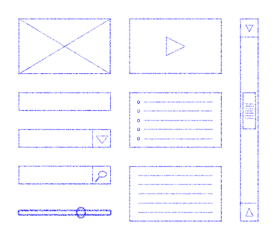
Download the Fireworks Mini Web Wireframing Kit - 90 Kb (.PNG)
The file is in .PNG format which is native to Fireworks and means you can edit and resize all the shapes in Adobe Fireworks.
Released under WTFPL License
iPhone Wireframe Kit - Google Docs
Monday, September 06, 2010 { 3 Comments }
Few weeks ago I saw this post on speckyboy.com that inspired me to try the Google Docs Drawing online tool.Google Drawing is very simple but powerful vector online tool. Probably the best thing is that you don’t need to download anything and can draw directly in the browser. You will get the filing that you are working in serious graphic program like Illustrator. Nice work Google! In order to use this tool you need to have Google account.
My experiment was to build iPhone GUI starting from with my previous iPhone PSD Template.
So the result is:
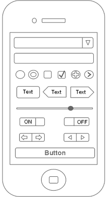
Download iPhone Wireframe Kit

Download iPhone Wireframe OR Download iPhone Empty Wireframe
You can easily personalize, duplicate, replicate, ungroup any element.
Released under WTFPL License
About Me <<<
Name: Vladimir Carrer
vladocar [at] gmail.com
Location: Verona, Italy
I'm a web designer, developer, teacher, speaker, generally web addicted ...
My projects <<<
- AI Prompt Directory
- Hand Drawn Icons
- Font Design Inspiration
- Font Pairings
- Free SVG Cut File
- Upcoming NFT projects
- Discord Tutorials
- Free Sublimation Designs
- Tech Feed
- MySQL Lite Administrator
- Quark Mini PHP CMS
- Formy - CSS Form Framework
- Emastic - CSS Framework
- Malo - CSS Library
- The Golden Grid
- 1 line CSS Grid Framework
- Two Lines CSS Framework
- Child Selector System - CSS Framework
- Better Web Readability Project
- Azbuka - CSS Typographical Base Rendering Library
- ClipR - bookmarklet for better reading
- CSS3 Action Framework
- CSS Mini Reset
- HTML5 Mini Template
- CSS Mobile Reset
- picoCSS - JavaScript Framework
- HTML Lorem Ipsum Crash Test
- Object Auto Documentation - JavaScript
- o - JS Library for Object Manipulation
- Foxy - CSS Framework
- Tumblr Free Theme - Better Readability Project
- Box - CSS Framework
- SMART CSS GRID
- nanoJS - Minimal JS DOM Library
- Flexy CSS Framework
- Katana is CSS Layout System made with Flexbox
- Micro CSS Reset
- 60 Grid System
- Simple CSS Button
- ramd.js JavaScript library for making web applications.
- Minimal Notes web app build with Vue.js
- Scribble Font for Prototyping & Wireframing
- Flex One - 1 CSS Class System
- Floaty - CSS Float Based Layout System
- Infinity CSS Grid
- CLI Convert websites into readable PDFs
- keywords-extract - CLI tool, extract keywords from any web page.
- screenshoteer - Make website screenshots and mobile emulations from the command line.
- Basic.css - Classless CSS Starter File
§§Previous Posts <<<
- GPT-3 and CSS Frameworks
- Don’t use CSS Reset use CSS Set
- One Page 2020 Calendar Print Version
- 3 CLI tools based on Node.js
- Scribble Font for Prototyping & Wireframing
- ramd.js - Small JavaScript library for making TODO...
- Katana.scss - CSS Layout System made with Flexbox
- Flexy CSS Framework
- nanoJS - JavaScript for DOM manipulation
- SMART CSS GRID
§Archives <<<
- May 2006
- June 2006
- July 2006
- August 2006
- September 2006
- October 2006
- January 2007
- February 2007
- October 2007
- April 2008
- June 2008
- July 2008
- August 2008
- September 2008
- November 2008
- December 2008
- January 2009
- February 2009
- March 2009
- April 2009
- May 2009
- June 2009
- August 2009
- September 2009
- October 2009
- November 2009
- December 2009
- January 2010
- February 2010
- March 2010
- April 2010
- May 2010
- June 2010
- July 2010
- August 2010
- September 2010
- October 2010
- November 2010
- December 2010
- January 2011
- February 2011
- March 2011
- April 2011
- May 2011
- June 2011
- July 2011
- August 2011
- September 2011
- October 2011
- November 2011
- December 2011
- January 2012
- February 2012
- March 2012
- April 2012
- June 2012
- August 2012
- November 2012
- January 2013
- March 2013
- June 2013
- October 2013
- November 2013
- March 2014
- September 2014
- October 2014
- November 2015
- March 2018
- May 2018
- June 2018
- July 2018
- October 2018
- January 2019
- January 2020
- June 2020
- April 2021
Other Profiles <<<
Content is licensed under a Creative Commons Public Domain License
